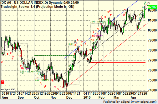
US Dollar Analysis
With the US Dollar Index now approaching the levels of April 2009, putting us at or near a 12-month high, it's time to get a feel for what may lie in store for the Dollar Index in the months to come. We came into the year predicted that the US Dollar would ultimately have a positive 2010, although we stated that our prediction wasn't meant to suggest that a sharp run-up would be what would happen. Less than five months into the year, we've definitely seen a sharp run-up. At the start of January, we predicted that the Dollar would hit the 82.00 level in 2010. We got there in March and were still there two weeks ago. Now we're at 86.00.
For those that are familiar with MoB (Make or Break) lines in e-Signal, you know that these lines use chart analysis to project potential time and price targets for a symbol. One point of confusion on these levels is that some people assume that the fact that a MoB level exists, the symbol must get there or the MoB was wrong. That's not actually the case. You can get MoB levels both below and above the market if you draw them off the most recent pivot low and high. That doesn't mean both will hit. You're basically getting a target scenario IF things keep moving in that direction.
But the power of the MoB is not just that it gives you a price target. It gives you a TIME target as well. In the chart below, which shows about 18 months of US Dollar daily data, the MoB blue and pink line is drawn from the high around 87.00 in April of 2009:
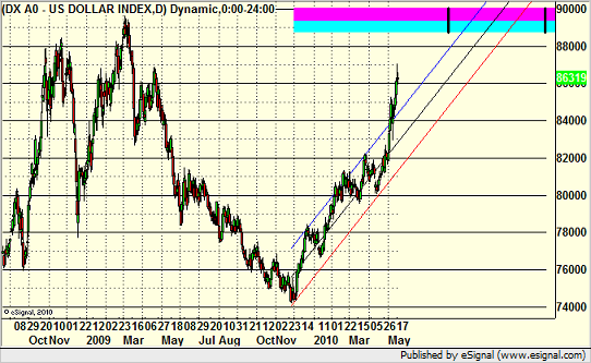
First of all, the thickness of the line suggests that this is a bit stronger of a target than a lot of the MoB lines that we see. Second, note that even drawing that line back a year ago, the line doesn't start until almost the end of 2009. Also, note the two black vertical lines, which show us the most likely point in time for the level to be hit.
What we found so interesting about this chart is that the regression channel lines off of the lows from last year, which so clearly channeled this move up until we broke out more sharply the last two weeks, also push the US Dollar Index into the MoB during the key time target.
Now that you have a broad cup, a two or three month handle of consolidation would put us back into the regression channel and poised for the final move up.
You can follow us on Twitter for more details by clicking here, or take a free or full trial to our various trade calling and education services here.
Getting Swept and Taking the Same Trade Again
Today we had a great example of what we call a "sweep" on an ES futures trade entry. In the futures market, you cannot fool around with your stops. You have to have them, and we suggest you keep them fairly tight. We use a max of 6-8 ticks on the ES, for example, as a stop. However, sometimes, you can spot a valid technical entry that triggers and stops so fast that really, all that happened was the market showed you that the area you were watching was valid for support and resistance. When that is the case, you can put the same trade with the same entry right back in.
We tend to ignore the futures and stock market in the middle of the session, which is the New York lunch period. It's represented by the red box in the chart below. However, coming back from lunch, sometimes a trade can be as easy to spot as the high or low of basing action for several hours. We targeted a short in the ES under 1163.50, the low just before lunch. Volume came back after lunch and the market headed down. Our stop was set for 6 ticks after entry. As you can see on this chart, the trade triggered short once, then stopped out almost immediately and just barely. This means that the market has identified that levels as being important, even though we triggered and got out for a 6 or 7 tick loss. So we put the trade right back in, and it triggered again. This time, it really worked, and we closed half at 1160.00 at A and the rest at 1156.50 at B for a net 20 tick winner overall:
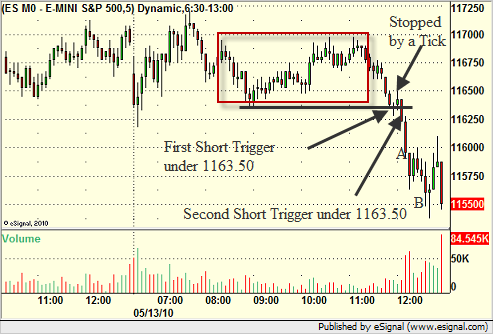
So we trade a 6 tick loser for a 20 tick winner, but you have to keep those stops or you'll get slaughtered in the futures market.
Also, if you are wondering where that final exit point came from, here is the same ES chart with our key Levels drawn. The red line that is a key Gann number came in at 1156, so we closed just above that level. It was also the end of a Seeker 9-bar setup, which is terminated by the red box drawn around the Seeker setup area:
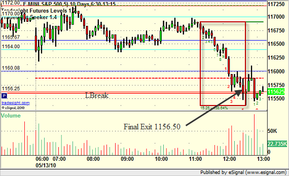
Both of these combined to leading us toward a solid exit point that was near the low of the day.
You can follow us on Twitter for more details by clicking here, or take a free or full trial to our various trade calling and education services here.
A Continuation about Average Daily Range
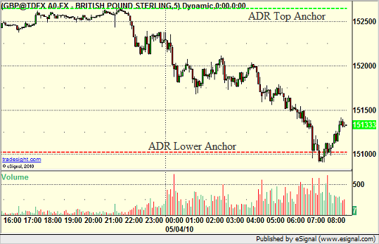
Yesterday in our Blog (found here); INSERT INTO `wp_posts` (`ID`, `post_author`, `post_date`, `post_date_gmt`, `post_content`, `post_title`, `post_category`, `post_excerpt`, `post_status`, `comment_status`, `ping_status`, `post_password`, `post_name`, `to_ping`, `pinged`, `post_modified`, `post_modified_gmt`, `post_content_filtered`, `post_parent`, `guid`, `menu_order`, `post_type`, `post_mime_type`, `comment_count`) VALUES we discussed a few uses for the Average Daily Range levels. In particular, we discussed the GBPUSD and EURUSD. Today, we have more examples of the use of the Average Daily Range Levels on those pairs, so let's review.
First, a recap of what Average Daily Range is: We use a 6-month trailing average, which means that we add up the ranges each trading session for the last six months and then divide by the number of days.
The EURUSD ADR is currently 138 pips. The GBPUSD is now 167 pips, up a pip from yesterday.
How did those levels get used in today's trading?
Once again, the EURUSD traded almost exactly 138 pips of range. You can see the Upper ADR (dashed green) and Lower ADR (dashed red) lines on the chart here. Since we're in the lower half of the day's range, the Upper ADR is anchored to the high of the session, and the Lower ADR projects the 138 pip mark:
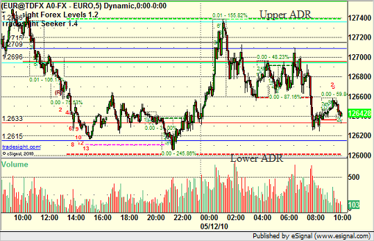
So specifically, the EURUSD once again recognized the range and didn't break outside of it, just like yesterday.
Now, on to the GBPUSD. Again, the Upper ADR is anchored to the high of the session because we are in the lower half of the range. The Lower ADR is 168 pips lower. Once you get into the European and then North American session, we break below the Lower ADR at point A on the chart and make a move, just like yesterday. But today's lesson shows us another side of how important these areas are. Just like any other Support or Resistance Level, once it breaks, it becomes the opposite:
That Lower ADR was Support, but look at how it was used as Resistance at points B and C on the chart later. These numbers are very important in trading.
You can follow us on Twitter for more details by clicking here, or take a free trial to our daily FOREX trade calling and education service here.
Tradesight Stock Market Preview for 5/5/10
The SP broke decisively below the triangle formation losing 26 on the day. This is follow through to the 4/27 initial break. The short term trend is now down with 2 key levels just below at the 50dma and static trend line.
Naz was lower by 57 testing the 50dma and static trend line. The next meaningful support below those two levels is the January highs.
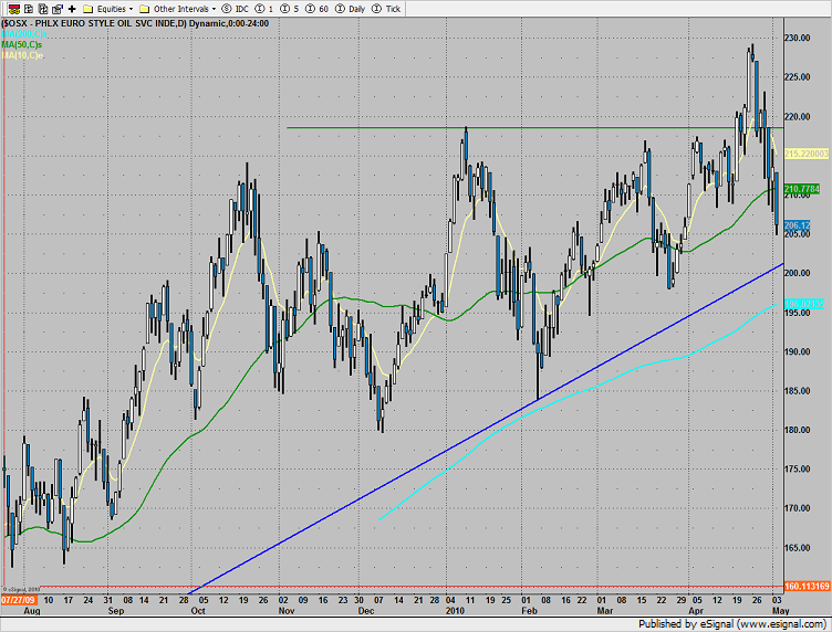
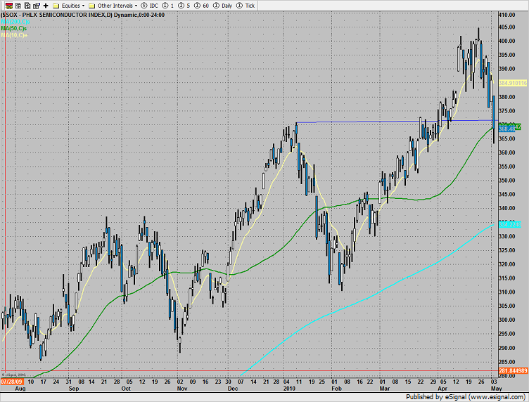
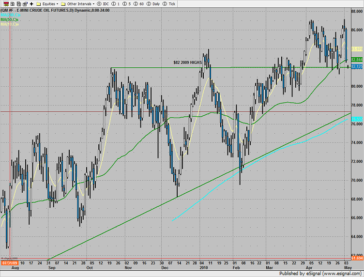
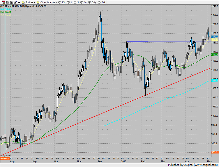
Multi sector daily chart:
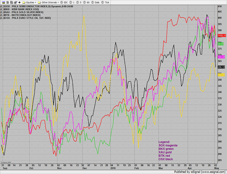
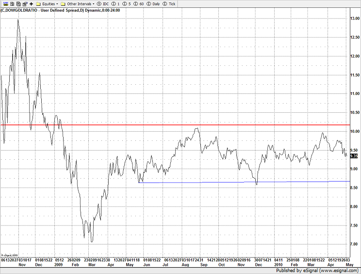
The Dow/Gold ratio has plenty of room for gold to gain favor over stocks before hitting the recent lows around 8.75:
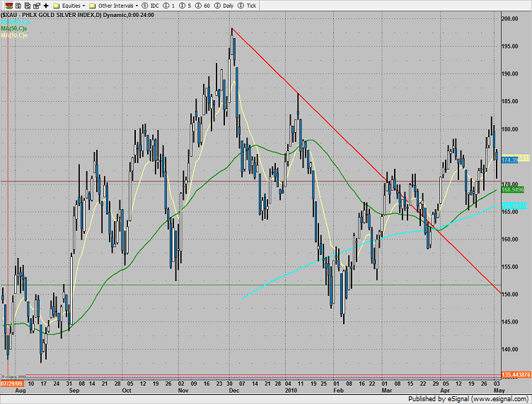
The XAU was top gun (-1.2%):
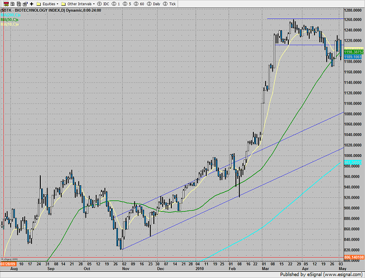
The BTK “B” wave bounce was rejected, set an alarm for a break under 1168.50:
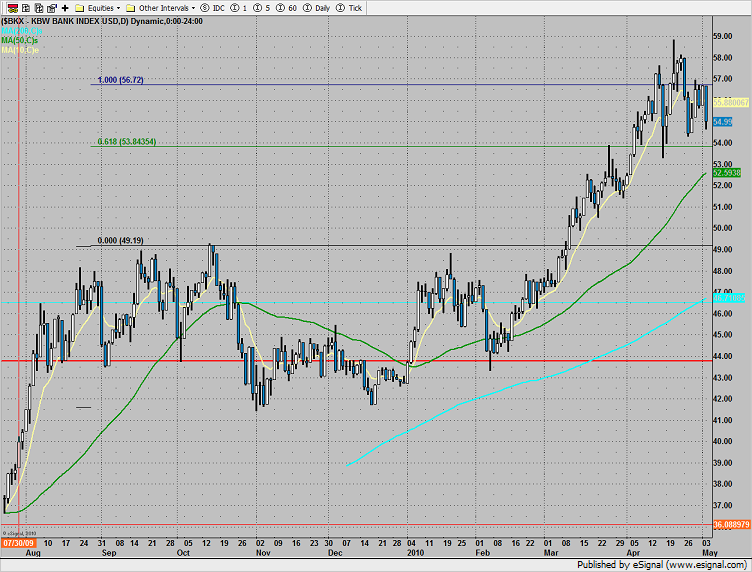
The banking index was lower by 3%. Note that many of the regional banks were considerably weaker than the BKX on big volume.
The OSX is getting close to the lower boundary of the active pattern. A break in this sector will be confirmation that the broad market is in a price correction rather than a rolling time correction.
The SOX closed right at the 50dma and under the prior breakout level.
Consistent with most market breaks, selling was across the board and included all of the non-safety asset classes. Oil was sharply lower on the day.
Gold was lower, not yet a safety asset class.
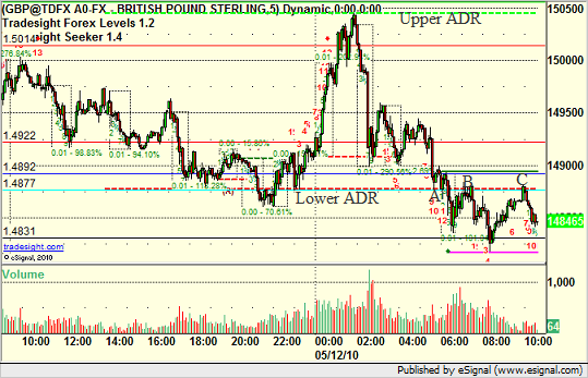
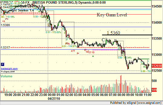
Even in Chaos, Average Daily Range Matters on GBP/USD
The markets had a wild session today, driven by a variety of news and global economic concerns. While US data this morning was good, concerns about the oil spill in the Gulf and a widening debt problem out of Europe led to a big push for strength in the USD. Despite all of that, one of our most basic tools helped guide us on trade management today in the GBP/USD, our favorite pair.
The tool is simply the Average Daily Range tool, which basically shows the six month range average on a pair. What is remarkable is how closely the market uses this point as a pause and potential reversal each day that it hits it. Currently, the GBP/USD trades an average of 162 pips per day (over the last six months). So, if you just take the GBP/USD trading in the current session and anchor the top of the range with the ADR High line, you'll see where the lower line ends up (162 pips lower):
Quite simply, this area, within a few pips, was about all that the market had the strength to cover. It's amazing how such a simply tool can help you qualify where exhaustion of a move might occur. How did that play out with our short trade today? Let's have a look at the chart with some additional key support and resistance levels:
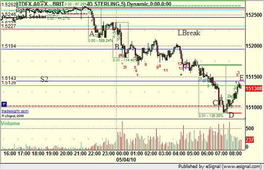
In this case, our short trigger was under LBreak (a Gann Level) at 1.5227 (triggered at point A) with a 25 pip stop that never hit. Our first target where we cover half was S1 (point B); INSERT INTO `wp_posts` (`ID`, `post_author`, `post_date`, `post_date_gmt`, `post_content`, `post_title`, `post_category`, `post_excerpt`, `post_status`, `comment_status`, `ping_status`, `post_password`, `post_name`, `to_ping`, `pinged`, `post_modified`, `post_modified_gmt`, `post_content_filtered`, `post_parent`, `guid`, `menu_order`, `post_type`, `post_mime_type`, `comment_count`) VALUES and that hit fine. We proceeded much lower overnight, and then in the morning took off another quarter of the trade at C, which was the ADR line. In addition, our Seeker tool completed a reversal setup box at D, which represented the turning point off of the lows around the ADR. We move our stop over S2 and stopped the last quarter of the trade at E.
Note that understanding where the average daily range lines landed got us our best exit piece of the trade.
You can follow us on Twitter for more details by clicking here, or take a free trial to our daily FOREX trade calling and education service here.
Forex Value Areas on Holidays
There are many uses to calculating the Value Areas for futures contracts and Forex pairs. Depending on whether you start a session inside or outside of the Value Area, there are a variety of trade setups that can be derived from knowing where the Value Area High and Value Area Low of the session are located.
However, sometimes a lesson can be learned in just seeing how much a symbol uses a Value Area when there isn't much going on. We started this week of with Japan closed for the first three days and the UK closed for the first day. This means that trading activity and the number of participants would be low. While that can have different impacts on the various pairs, if you look at some of the other symbols, such as the NZDUSD, what would you expect?
My personal expectation would be that the NZDUSD wouldn't see a lot of action if banks in Japan and the UK are closed. It isn't like people decide to trade the NZDUSD instead.
So let's have a look at the NZDUSD with a variety of key support and resistance levels drawn from our open on Sunday. The light blue, or cyan, lines in particular are what we want to focus on here as they represent the Value Area High and Value Area Low. The area between these two are where 70% of the action occurred in the prior session. When you open inside the Value Area, it takes some volume and activity to break out of that range, and with so many of the global banks closed, we wouldn't expect to see that. So here's the chart:
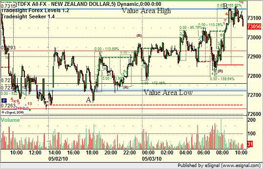
Note that the pair used the early part of the session finding support at the Value Area Low, and then later headed up and stalled out right at the Value Area high at point B. In fact, except for a brief spike at A, the NZDUSD spent the whole session exactly inside of the Value Area.
Even if that doesn't provide the specific trade call setup that we often use with the Value Area, it certainly demonstrates the validity of the numbers even in a dull session.
You can follow us on Twitter for more details by clicking here, or take a free trial to our daily FOREX trade calling and education service here.
The US Dollar Index pre-Fed Announcement
As we approach yet another Fed announcement where no change in rates is expected, we wanted to do our usual analysis of the US Dollar Index to see if there is anything critical from a technical perspective that we should be aware of heading into the news.
So let's have a look at the US Dollar index daily chart with a regression channel off the lows and the exhaustion 9-bar counts:
One key feature of the 9-bar exhaustions is that when they line up against key support and resistance, they are high-probability turning points in the market. Today's bar, once it completes, will be the ninth bar of the move. Now, remember that even past the ninth bar, the setup phase of the exhaustion doesn't have to terminate until we get the dashed box drawn around the area. For example, if you look at point A that I have designated on the chart, you'll see that the box ended right there, which was several bars past the 9-bar count. This was also against the upper regression line and thus led to a downward turn for a month in the US Dollar Index. You can then see the 9-bar move up that followed, where the box is drawn and terminates at B, also just outside and above the upper regression line. That one led to a pause but not much of a pullback in the market as the energy exhausted.
In both cases, the ninth bar itself occurred close to the upper regression line, and then the setup box completed a few days later at or even above the line. For purposes of this general analysis, we'll ignore the 13 bar buy and sell signals on the chart as the energy setup moves themselves can be useful.
Now, let's consider where the chart is today at point C. This is the ninth bar of the count, but we are in the middle of the regression channel. Therefore, while the market may have expended upward energy to get here, we aren't yet near the major resistance that has been the upper regression line. There are a couple of ways that this can play out, and the key will be to see where the box draws that represents the end of the setup move.
If this extends to the upside for a couple of days and we get the signal near the upper regression line, then it will represent another short-term exhaustion against resistance and a short-term sell signal. However, if the box completes sooner, it would indicate that the momentum of this move is less than prior moves. This would give us an earlier sell signal before the upper regression line, BUT, it increases the chances of a more major turn in the market that might break the lower regression line moving forward.
The fact that we have gotten at least the 9 bar completion heading into the Fed meeting day is always interesting. It means a signal is coming soon, and the Fed announcement may be what drives it.
Some Basic Pointers on Stops for GBPUSD
One of the things that we like to focus on is something called Market Direction. We utilize a tool in Forex, Stocks, and Futures that measures three levels of market direction for the day, starting with the open of the market. In Forex, the open is considered 5 pm EST, or global rollover. From that point forward, we compare where the market is compared to the opening price, the midpoint of the session so far, and a 10 EMA. We end up with three lines. If we are above two, we consider market direction to be green. If we are below two, we consider market direction to be red.
Today, we had a short entry on the GBPUSD under a key Gann level at 1.5425. This triggered heading into the European session (charts here are in Pacific Standard Time) at point A. We covered half of the trade approaching S1 at B and kept the second half on, looking to adjust our stop for later:
By then monitoring the US Dollar Index with our market directional tool as described above, we can see the point in the trade where we would want to exit the final piece of the GBPUSD. Here's the US Dollar Index on a 5-minute:
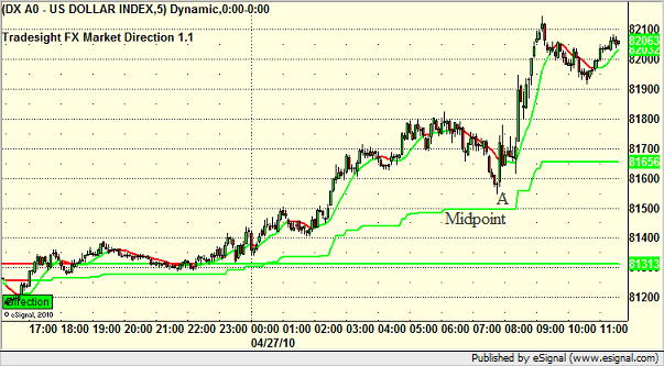
Note how it was approaching the midpoint around 7:30 am PST at A. A move under that line would flip market direction to red, thus signaling us to exit the GBPUSD trade and lock in the gain. That would have occurred around the 1.5360 on the GBPUSD chart above, which I've drawn with a black line.
The midpoint on the US Dollar did not break, and thus we did not stop out of the trade. This kept us in the trade for the next spike, which was a news spike based on debt downgrades. Very important to use logical stops in your trading and not just exit because you feel like things might be reversing. Take a top down approach and let the market be your guide.
You can follow us on Twitter for more details by clicking here, or take a free trial to our daily FOREX trade calling and education service here.
Classic Technical Activity to Start the Week on EURUSD
Gap fills, Pivot series, and Static Trendlines were all in play and behaved properly to start the week. Because all three were present, I thought I would use this as an example of how these various technical factors can work independently.
Here's a look at the GBPUSD 5-minute chart with the tail end of Friday's trading and then the Sunday open with a small gap up. These charts are on PST:
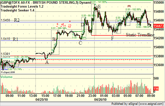
The first factor was that the GBPUSD gapped up slightly. We know that 80% of gaps fill the same day, and this was in the 80% as the GBPUSD headed down to fill the gap early at A. Gaps in Forex obviously only occur on Sundays, so it is nice to get the fill of the gap out of the way as quickly as possible.
The second factor was proper use of the Pivot series. Our Pivot series calculations are based on the traditional FX trading day, meaning that they are calculated from a 5 pm EST end of day/start of day. This is global rollover. Our trade call was long over the R1 level, and the important factor is how the GBPUSD used that level, triggering long at B breaking through but then exactly retesting the level to the pip at C, which gave traders a second shot at entry since the first move was fairly early in the session.
Our first target to sell half was at R2, and the move occurred from C to D very quickly. There was also a 9-bar move (the dashed box is drawn around that move) that ended at around the same time. The next push higher on the European open terminated in another 9-bar move that ended at E and that was the high of the session. However, this gives us our final technical to look at, which is the Static Trendlines (red line) created by that 9-bar move up to E. Static Trendlines often become trade-to targets and support after an energy move like that, and you can clearly see that the GBPUSD used the Static Trendline exactly at point F.
The rest of the session was spent between the prior high and the Static Trendline.
You can follow us on Twitter for more details by clicking here, or take a free trial to our daily FOREX trade calling and education service here.
A EURUSD New Target?
The daily chart of the EURUSD has broken a key four month trendline. That's news in itself.
However, there is more going on with this move. Let's take a look at the daily chart with the obvious downtrend line drawn:
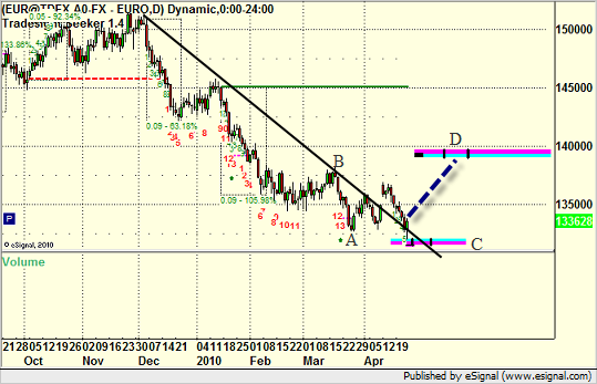
Note that I've drawn the lower MOB (Make or Break) line and a pivot MOB. Here's how it works. If you take the low at A and draw the MOB line off of it (thanks to e-Signal's Advanced GET platform); INSERT INTO `wp_posts` (`ID`, `post_author`, `post_date`, `post_date_gmt`, `post_content`, `post_title`, `post_category`, `post_excerpt`, `post_status`, `comment_status`, `ping_status`, `post_password`, `post_name`, `to_ping`, `pinged`, `post_modified`, `post_modified_gmt`, `post_content_filtered`, `post_parent`, `guid`, `menu_order`, `post_type`, `post_mime_type`, `comment_count`) VALUES you get the lower blue and pink line. The way that MOB's work is that they give you a potential projection for the market both in terms of price AND time. That last part is what makes them interesting. The two little black hash lines inside the MOB line give you the ideal window where this price would hit, but the main point is that the projection is for the length of the line ONLY and not beyond.
So the MOB calculation from the low at A gives us line C. Note the intersection of that line with the downtrend line that I've drawn in black. The EURUSD broke that trendline to the upside, but then retraced down to not on retest that downtrend line from above, but also hit the MOB just ahead of the ideal window. It hit it to the pip and reversed hard on Friday.
This means that the EURUSD has broken a key trend and retested that trend, turning what was resistance into support. What happens from there?
Well, we need to start thinking about an upside target for the EURUSD on this next move. This can be accomplished by drawing the MOB from the most recent pivot high, which is point B. This gives us the line at D, which is a fairly large MOB line. Again, however, we focus on the space between the two little black lines on the MOB as being the ideal target timeframe, which would put us about 600 pips higher in just over a month. Obviously, the market can go up and down during that move, but there is a better than average chance that the MOB will be hit in that area, so trading strategies to the long side on the EURUSD should be given priority.
You can follow us on Twitter for more details by clicking here, or take a free trial to our daily FOREX trade calling and education service here.