Let’s discuss the current state of the US Dollar Index daily chart from multiple timeframes, as I think this area is going to be fairly critical in determining whether the US Dollar has formed a multi-year bottom or not.
Bottoms take time, especially when the downtrend on the US Dollar Index lasted from 2001 to 2009. The process of turning that corner doesn’t happen overnight. So, let’s start by looking at the short term US Dollar Index daily chart:
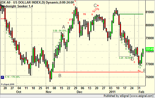
What we see is that we had a move up in November that gave us a 9-bar Seeker setup count that ended at the point labeled A on the chart. By definition, that gives us the static trendline of that move as the red line at B. That should be significant support if we come back to it. The 9-bar setup later turned into a 13-bar sell at C, which has been the near-term top area. Since then, we’ve had a 9-bar Seeker count setup that ended at D, but continued lower anyway. Look how close we came to the red static trendline on that move (but didn’t break it). This is all very technical action, and that line should be support if we hit it directly after E.
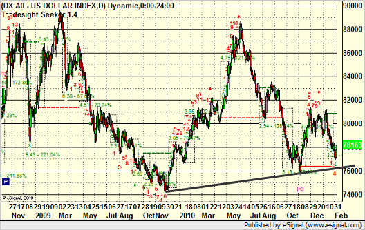
Now, let’s back the chart out to show the better part of a year and the intermediate term downtrend line that we broke in November, which was a significant and key break:

The problem is that that line was never retested, as a key trendline should be, and to hit it now and turn back up requires a much lower move first.
If we back the chart out even further and show two years of data, we end up in a scenario of an inverted cup and handle along the RISING trendline, but more importantly, we have a rising trendline:
Keep in mind, holding that line is now a part of the bottoming process, because if we back the chart out even further and show a decade of data on a weekly formation, you can see the 8-year downtrend line that broke, and this uptrend has been in place since:
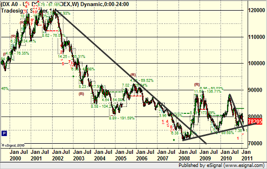
From a technical perspective, we have a downtrend from 2001 to the end of 2008. We have an uptrend that is very gentle (the first one always is) that has formed since that bottom occurred. We have several intermediate moves, the most recent of which was a downtrend that broke in November. We have Seeker count construction with a solid static trendline that lines up as support around that rising uptrend.
Even though we haven’t retested that intermediate downtrend line shown in the second chart, the overall picture still feels more bullish than bearish. A break under that uptrend line would mean that the bottom did not confirm. A turn up that takes out the 81.20 area on the chart would confirm the bottom.
Follow our Blog for comments on all markets from a technical perspective.
US Dollar Update...
February 4, 2011
|In Tradesight