Every year, it comes down to this. Let’s have a look back at the market, analyze what happened, talk about how trading was throughout the year, and discuss the macro-economic ramifications of it all on the markets. It’s never a short report, so buckle up, maybe print it out, and let’s get to work.
We will cover all markets here, but the main report of Tradesight remains the stock market, and from a macroeconomic perspective, there is much to discuss here. Forex stuff will be covered later in the report.
As a reminder, if you read last year’s end of year report (click here); INSERT INTO `wp_posts` (`ID`, `post_author`, `post_date`, `post_date_gmt`, `post_content`, `post_title`, `post_category`, `post_excerpt`, `post_status`, `comment_status`, `ping_status`, `post_password`, `post_name`, `to_ping`, `pinged`, `post_modified`, `post_modified_gmt`, `post_content_filtered`, `post_parent`, `guid`, `menu_order`, `post_type`, `post_mime_type`, `comment_count`) VALUES we talked about the VIX and how disappointing it was that the Volatility Index remained in the low teens for so long, something which general means that market action and range is limited. Also, NASDAQ volume plays a key role. So before we head into the index charts, let’s start with a look at how those were in 2007.
In 2005, NASDAQ volume averaged well under 2 billion shares a day, which makes for tough trading. In 2006, it averaged around 2 billion shares a day, which was good. Here is a look at 2007 NASDAQ volume day by day, with the 2 billion share line drawn:

You can see that the majority of days were over 2 billion shares. In fact, if you ignore a few of the very low ones (holidays); INSERT INTO `wp_posts` (`ID`, `post_author`, `post_date`, `post_date_gmt`, `post_content`, `post_title`, `post_category`, `post_excerpt`, `post_status`, `comment_status`, `ping_status`, `post_password`, `post_name`, `to_ping`, `pinged`, `post_modified`, `post_modified_gmt`, `post_content_filtered`, `post_parent`, `guid`, `menu_order`, `post_type`, `post_mime_type`, `comment_count`) VALUES over 80% of the year saw better than 2 billion NASDAQ shares. That’s a great number for trading purposes. Now, here’s the VIX:
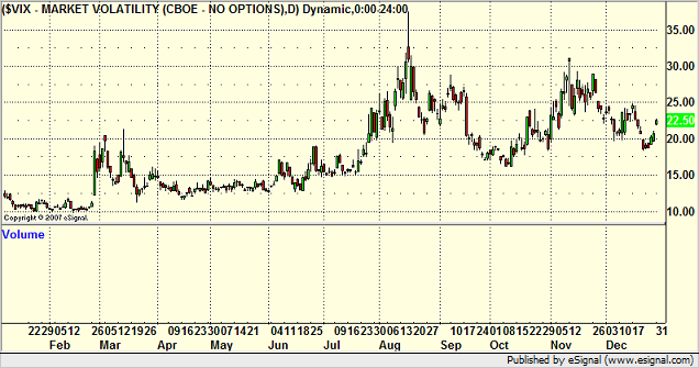
Much different story than 2006. The VIX not only came out of the low teens early in the year, but it held up above 20 for most of the second half of the year, including a spike near 40. Remember that back in the 1990s, a spike to 40 on the VIX usually represented a bottom in the market in the short-term. This is a panic scenario where most of the bulls have thrown in the towel. So where did the spike to 40, which was in August, occur versus the NDX? Here’s the NDX for the year:
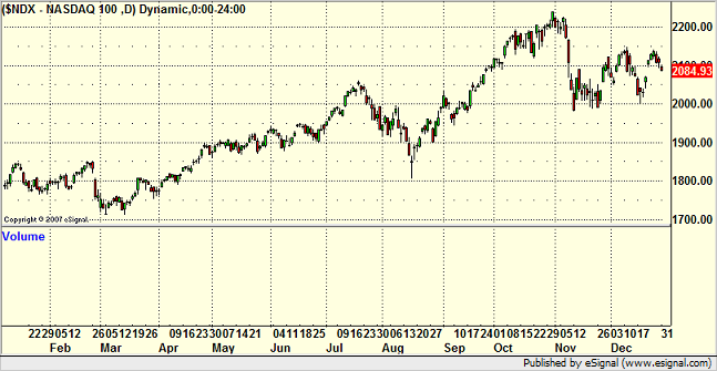
You can plainly see that the market rolled in July and the NDX went from 2050 to 1800 in a few weeks, which was a 10% drop. The low day was the place that the VIX almost hit 40. Unlike the last five years, I think the VIX is showing that it has meaning again. It also is showing us that intraday volatility is better than it has been. We’ll get to what that meant for us in a bit.
Since I just put up the NDX, let’s talk about it. It started the year at 1756 and closed at 2084. So, the tech-heavy NASDAQ gained 328 points, or 18.6%. There was obviously a lot of good volatility, up and down movements, and we already discussed the great volume.
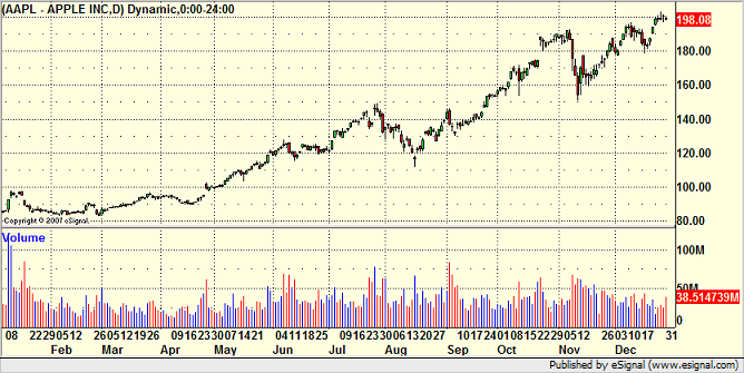
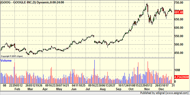
In general, this means that it was a good trading year for us, particularly once again for our intraday trading that we do in the Trading Lab each day. We profited constantly from stocks like AAPL (our daily bread and butter); INSERT INTO `wp_posts` (`ID`, `post_author`, `post_date`, `post_date_gmt`, `post_content`, `post_title`, `post_category`, `post_excerpt`, `post_status`, `comment_status`, `ping_status`, `post_password`, `post_name`, `to_ping`, `pinged`, `post_modified`, `post_modified_gmt`, `post_content_filtered`, `post_parent`, `guid`, `menu_order`, `post_type`, `post_mime_type`, `comment_count`) VALUES RIMM, and GOOG. AAPL spent the second half of the year with more than 4 points of range each day on average, and AAPL is such a consistently technical trader, it’s hard not to make money. Looking back on my stock profits for the year, over 35% of them came in AAPL alone, and if I had a way to really check, I would bet than most of those gains were in the first two hours of the trading day. Just something to keep in mind.
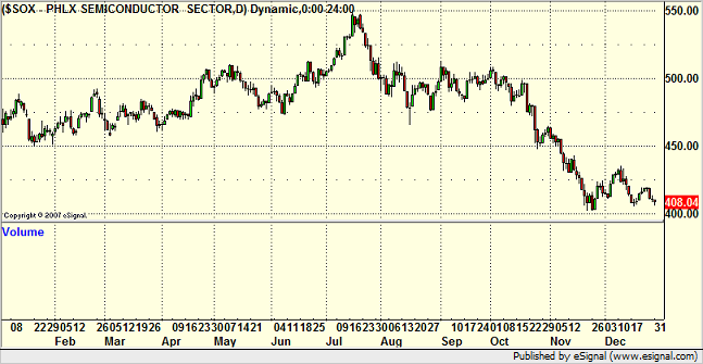
One thing that makes the NDX move interesting is taking a look at the two key sectors that generally benefit the NASDAQ the most. The SOX was actually down sharply for the year, especially late in the year:
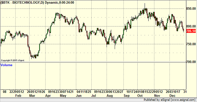
And the BTK was rangebound at best:
I think when you see those charts, you have to recognize the role that AAPL:
GOOG:
And RIMM:
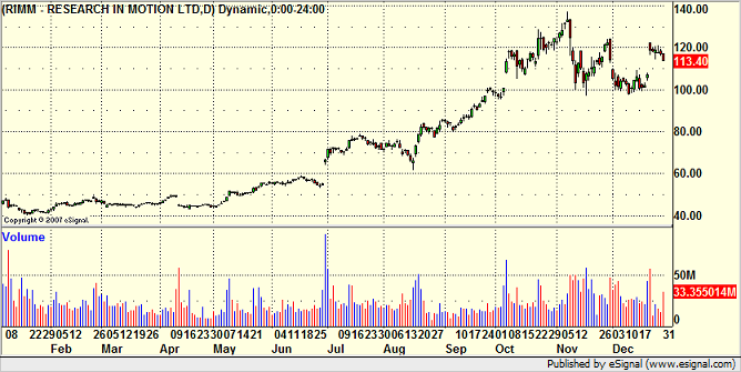
Played in the NDX move by themselves. I think once again, this puts these particular stocks in a place where they are open to selling as we head into 2008. The gains that they posted by September and October led to a situation where people were unwilling to sell them late in the year and lock in capital gains for 2007. I would start by watching AAPL’s earnings, which are due in just over a week, and expect a decline following the earnings, if not sooner. The one thing that could boost the stocks from here would be a split announcement.
So the SOX and BTK suggest that maybe, despite the volatility and volume, the NDX chart is not representative of a broad gain in the markets for the year. Was it an ideal year for swing trading (holding positions for several days in a row)? If you look at the NDX chart, it looks like it could have been. But the SOX and BTK don’t look so interesting. How about the biggest, broadest index of them all, the S&P 500? Here it is:
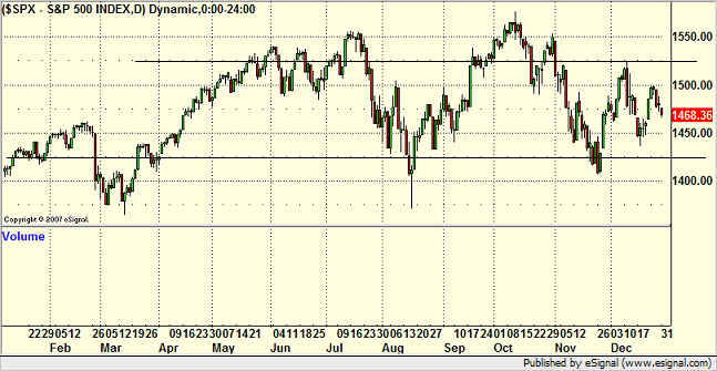
For the year, it started at 1418 and closed at 1468. This is a 3.5% gain in the broad market. The high to low range was just over 150 points, and 80% of the year was spent in a 100 point range between the two lines. This is opposed to the prior year, where the S&P had 220 points of range and a 13.4% gain from start to finish.
In other words, the broad market this year was unexciting and contained. INTRADAY TRADING ACTION was back to the way that we like it. This makes the calls in the Trading Lab much more valuable than the calls in the reports on average. There were very few days that we couldn’t find something to do in the room with our main trading stocks, but daily chart pattern setups were less useful than in the prior year because the market never really got legs overall.
Another interesting note about the year is the bond market, which had turned down earlier in the year (rates on the rise) and has since reversed and closed at highs (rates at lows); INSERT INTO `wp_posts` (`ID`, `post_author`, `post_date`, `post_date_gmt`, `post_content`, `post_title`, `post_category`, `post_excerpt`, `post_status`, `comment_status`, `ping_status`, `post_password`, `post_name`, `to_ping`, `pinged`, `post_modified`, `post_modified_gmt`, `post_content_filtered`, `post_parent`, `guid`, `menu_order`, `post_type`, `post_mime_type`, `comment_count`) VALUES presumably due to the flooding of liquidity by the Fed to offset the mortgage concerns. Here’s the Bonds:
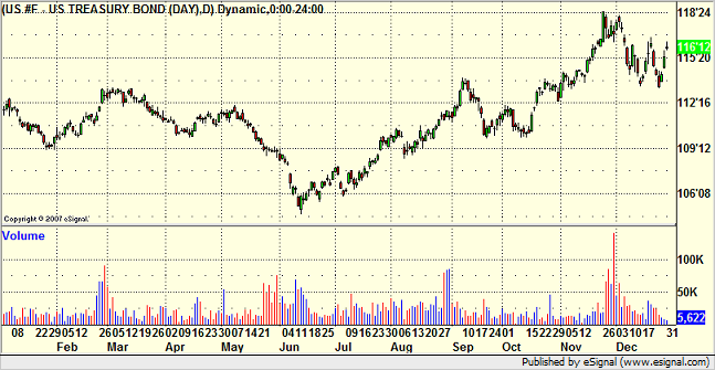
That is the biggest surprise of the year to me, as I expected rates to rise throughout the year. But, I wasn’t anticipating the record interventions by the Fed.
So from a stock trading perspective, I think that you look back at your results and should expect to find that the intraday trading results were much better than anything that was longer term.
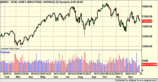
I’m not a big fan of the Dow Jones Industrial Average, but I’ll put it up here just to have it:
Two other comments related to stocks. One of my favorite sectors of the market to trade is the small cap sector. We’ve had some enormous years in this arena. When this sector is working, there’s nothing like finding stock after stock breaking out of great patterns and running from $5 to $6 in a day or two. It adds up quickly. However, here is the Russell 2000, which is the main index for the sector:
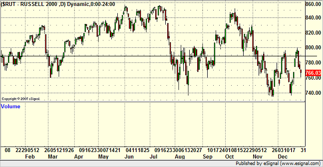
A very disappointing year for the Russell, and easily the worst year for the small cap stocks in the last six. It closed red for the year, but it never really had any significant runs. The best period was September and early October.
The other comment is about the report that generated probably the highest percentage of winners this year, which was the ETF report. This is more of a swing trading-based report, which means the calls are designed to play out over several days and basically just plays the indices. The QQQQ strangle calls in that report, which are made monthly, did very well this year, with only two complete losses and three plays that doubled or better. Overall, between 75 and 80 percent of the ETF calls worked. The other bonus of the ETF calls is that many are “pieced into,†which means that you start with small size and add as the trade works on a broader scale. That means that even if you do get stopped out on the initial trade, the loss should be tiny. The whole year is not about the ETF service as light volume and flat periods make it tough, but there was plenty of great opportunities at various times.
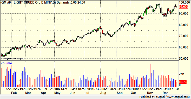
Was there anything this year that just plain doubled? Yep. Oil. Straight run from about $50 to about $100. Yuck:
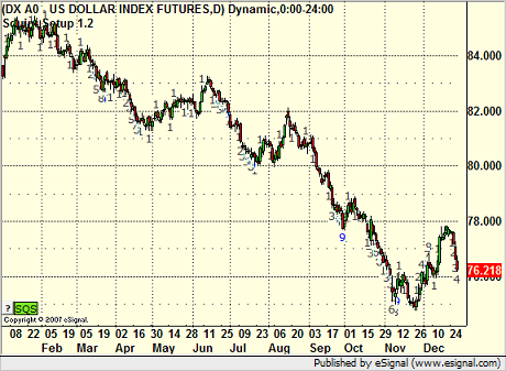
The connecting point between the stock market and the forex market to me is the US Dollar Index. Here is a look at the year in that index:
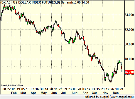
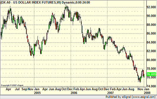
Now, to compare this to 2006, the US Dollar Index spent most of the year in a 4-5 point range. The range here was over 10 points, and after about April, things really started to move. This gives us a clue about how the forex market was to trade for the year, but we’ll talk about that in a minute. Let’s look at the Dollar Index in weekly form going back further so you can see how much more range there was here, especially in the second half of the year, versus something like 2006. 2005 and 2004 were good years, but I think we will look back at 2006, especially the second half of that year, and view it as one of the most extended doldrum periods in the forex markets:
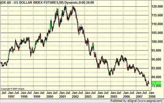
And here is a look at the US Dollar Index over the last decade, which is interesting:
I think that the more important macro view, and I’ve said this in the past, is to look at all of the data on the US Dollar Index, going back to 1985. Here is that monthly data:
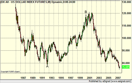
I’ve marked two points on that chart, and I think they are significant. The chart begins on a serious decline and bottoms out at A. Point A represents the switch in our government policy from deficit-spending to balancing the budget, which occurred throughout the 1990s under Clinton (point A actually marks, to the day, his election). Point B represents the switch back to deficit spending via tax cuts and increased Federal budgets (the change occurs in a policy shift marked, obviously, by the election of the current President). Pretty hard not to see the connection and the impact on the Dollar. I bring this up because we are entering an election year here in the US, and the outcome of that election will have an impact on the US Dollar more than anything else. This could lead to a significant change in direction on the US Dollar Index, and we will be monitoring this heavily.
Having said that, the forex markets ended 2006 in one of the longest, slowest periods that I’ve seen. I am a firm believer in the idea that markets cycle and that there are slow periods in any market, probably several lulls in a year. The basis of my trading system in the forex markets is not to try too hard to force winning trades during the lulls, as it is virtually impossible to pull winners out of a market that isn’t moving consistently. The general concept of the system is that the market tends to go through 2 or 3 lulls lasting 4-6 weeks each year, and you just ride those out and keep your losses limited. 2006, however, brought us almost 6 months in a row of a slow period that really didn’t start to come to an end until early 2007, as mentioned above. The rest of the year, however, saw very little in the way of slowdowns. Ranges, which had dipped remarkably in the second half of 2006, came back strong. We now have computed average daily ranges for the major pairs, and some of them have shifted a bit since last year. Here are the numbers we will be using as averages in 2008.
EURUSD = 115 pips
USDJPY = 90 pips
GBPUSD = 145 pips
GBPJPY = 190 pips
USDCHF = 110 pips (significantly lower)
AUDUSD = 90 pips
NZDUSD = 85 pips
USDCAD = 80 pips
GBPCHF = 145 pips
EURJPY = 165 pips
Before we dig into some of the individual pairs, I wanted to comment on two things. First of all, August, which is typically a slow month in all markets, including forex, was exceptionally big this year. Easily the best month of the year in forex. Just goes to show you that you just never know when the good periods will be. Also, the daily chart of the US Dollar Index is particularly useful to watch from the perspective of a Demark count. Here is the index again this year with the 9-bar counts, and notice how many times the high or low occurs on the ninth bar:
So, let’s dig into the pairs. Once again, the GBPUSD was the best trading pair, with good average range and lots of overall movement:
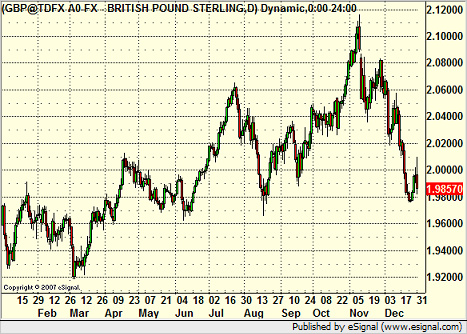
The high to low range for the year was 2000 pips, which is terrific.
Here is a broader perspective on the GBPUSD, the weekly chart going back much further:
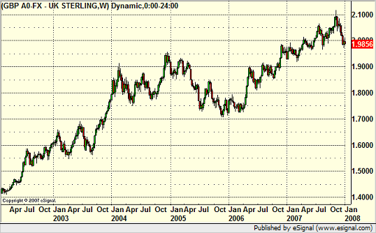
Not much else to say here except the trend continues.
The EURUSD had a very directional year overall:
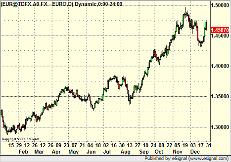
The range here was again 2000 pips, but it occurred with several back and forth moves. As a reminder, the prior year’s range on the EURUSD was 1200 pips, but over six months found the pair stuck in a 400 pip range. This is SIGNIFICANTLY better from a trading perspective.
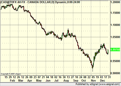
The USDCAD closed out the year near par after dipping to a level where the Canadian Dollar was worth more than the US Dollar:
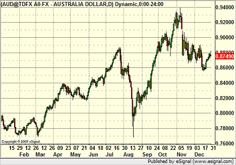
The AUDUSD actually had some great movement in the second half of the year, along with great daily ranges, which makes it very interesting because it is cheap to trade:
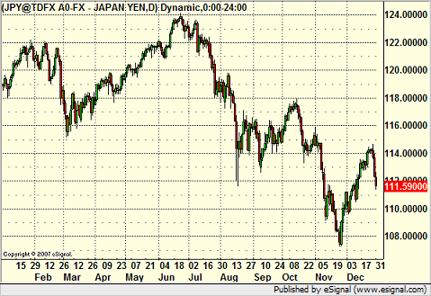
Not much overall excitement in the USDJPY:
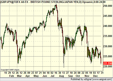
The GBPJPY, which had been a favorite for a long time because of the so-called “carry trade,†came back sharply this year with lots of wild movement. This is a head and shoulders formation overall, which could lead to an ugly downside move if it breaks:
So that was the year. The last six months were great for forex, the whole year saw great trading volume and good volatility reading for stocks, but a lot of that is deceptive because the broad market went nowhere, the traditional tech sectors like the SOX dropped, and the small caps had their narrowest year of the last decade. As I always say, markets cycle, and the reason that I trade everything is because I want to be able to move to where the action is. Fortunately, there was plenty to be found in 2007.
What are the keys to 2008? With all of the talk of recession and the credit crunch that is occurring right now, I would expect some volatility. Most important, I think stock players need to be ready to play the short side a little more than they were forced to in 2007. I’m looking for better range out of the S&P. For the forex markets, there will definitely be continued volatility due to the credit crunch, but the second half of the year, especially August and beyond, is an unknown. All eyes will be on the US elections, and unless there is a clear leader between the parties in advance, the currency market will probably slow down a bit, waiting for an outcome. I would also prepare for the possibility of a 3-way race this time, and that might create even more uncertainty for the currencies late in the game after the summer conventions.
Either way, we look forward to 2008. Thanks for being the best subscribers in the world.
2007 End of Year Recap of All Markets...
January 1, 2008
|In Tradesight